Hop into Figma, and Let’s Get Started: My First UX/UI Project Using Figma
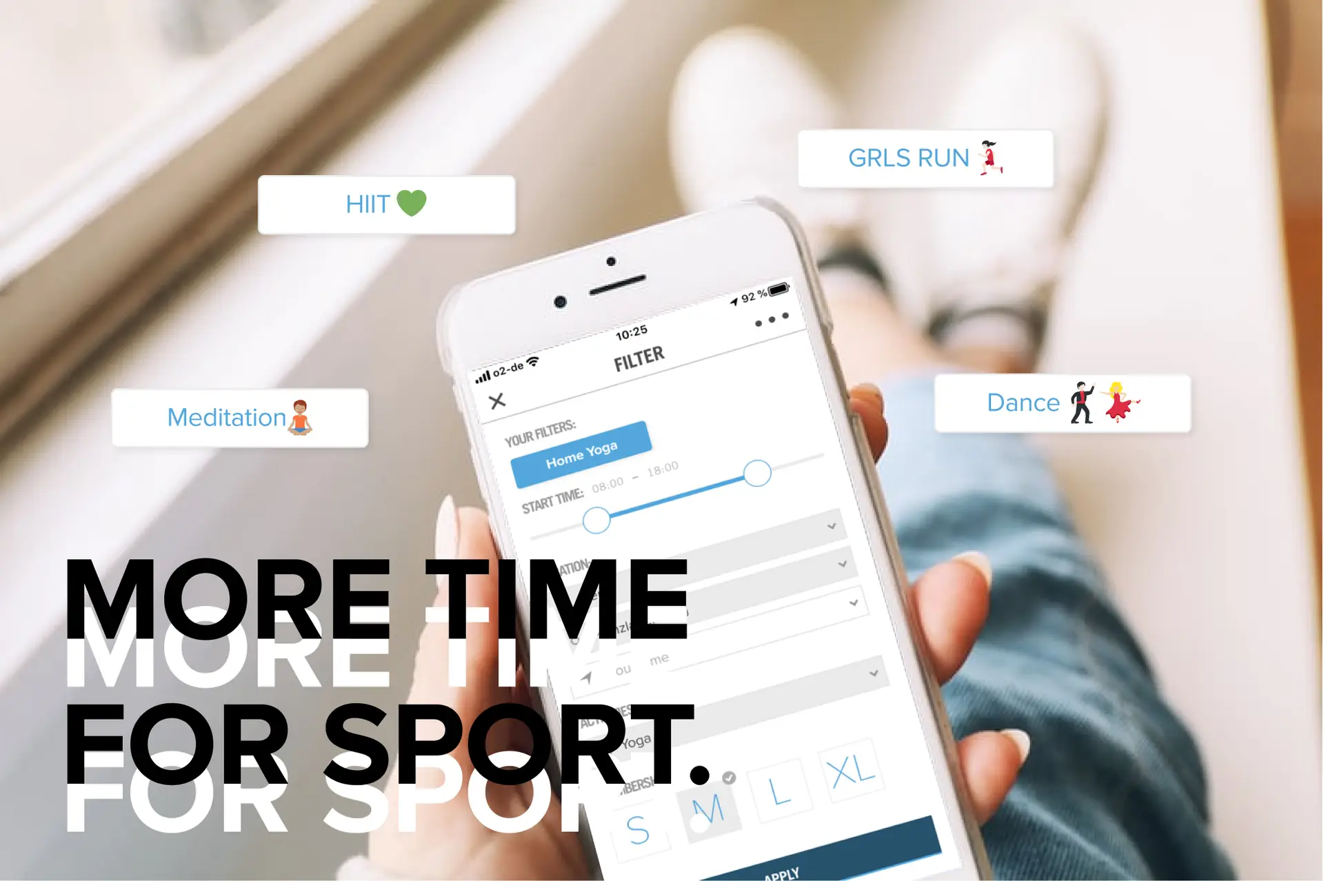
As a UX/UI designer and a sports enthusiast, I love keeping things dynamic, both in my work and personal life. From morning yoga to gym sessions or outdoor workouts, I like the flexibility that comes with the Urban Sports Club (USC) app, which offers access to various fitness facilities. However, I noticed a UX flaw in the app that could improve the overall user experience. The app, while convenient, doesn’t allow users to save their filter preferences—forcing them to re-enter their filters every time they open the app.
This sparked an idea: why not design a filter-saving feature that would improve the app’s usability? And to challenge myself further, I decided to work with Figma for the first time, moving away from my usual tool, Sketch. Here’s how I tackled this project and what I learned along the way.
Problem Statement
The USC app provides an intuitive way to find and book sports sessions, but lacks the ability to save filter preferences. Each time users reopen the app, they have to reset their filters, making the process repetitive and time-consuming. My task was to design a feature that would allow users to create, save, and activate their preferred filters in a seamless way.
This project would take four days, during which I aimed to maintain the app’s design language and user experience while integrating this new feature. It was also my first time using Figma for an end-to-end project—from wireframing to prototyping.
The Design Process
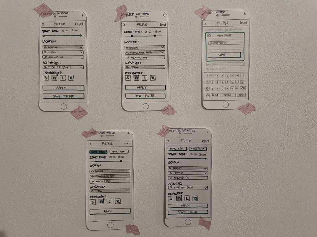
My design process always begins with pen and paper. I sketched out user flows and existing app functionalities, thinking about where this new feature would fit best. I tested the app extensively, identifying where users might most intuitively look for a filter-saving option. Then, I moved on to a paper prototype, which allowed me to see how the feature could interact with different screens without getting bogged down in digital details.
I wanted to create a feature that would not only save users time but also make the experience more personal and frictionless.

Feature Requirements:
- Unlimited individual filter creation
- Customizable filter names
- Easy access and navigation
- One-click activation of saved filters
Tip: Spending extra time on the paper prototype stage is critical. It lets you map out all necessary screens and interactions before jumping into digital wireframes. Testing your ideas with users—or even yourself—can uncover pain points early, saving time on revisions later.
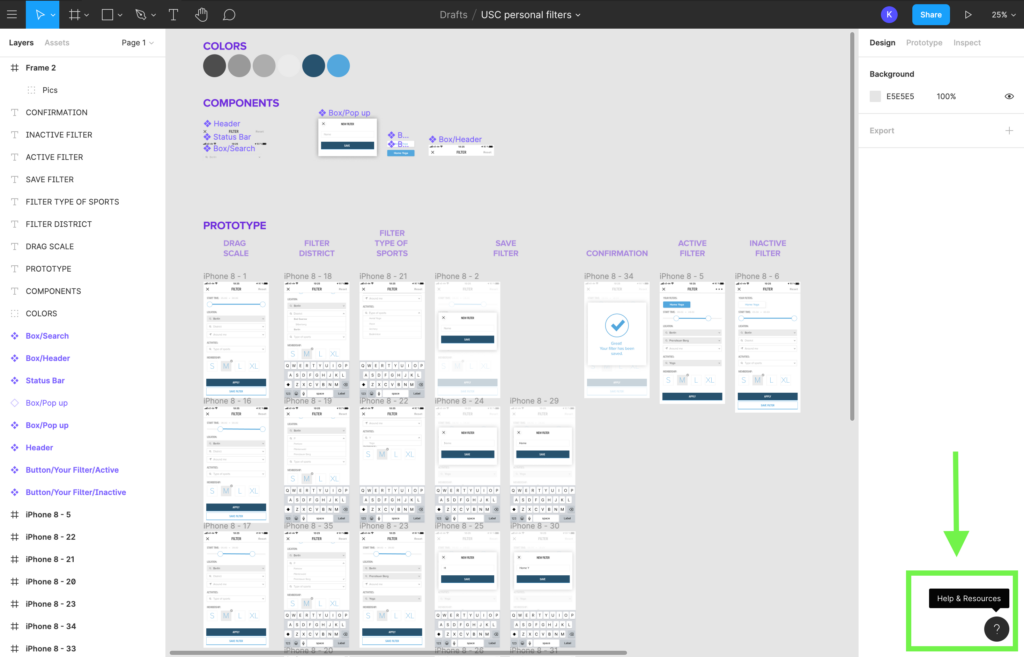
Once I was confident with the paper prototype, I defined reusable design elements that could appear on multiple screens. This made the design process smoother as I could turn these into components in Figma, ensuring consistency across the interface.
Getting to Know Figma
As this was my first time using Figma, I was eager to explore its features. It didn’t take long to get accustomed to its similarities with Sketch—many of the keyboard shortcuts are the same, which helped ease the learning curve. However, I found some unique elements that made Figma stand out:
- Smart Animation for Prototypes: I was particularly excited about Figma’s powerful prototyping capabilities. With smart animation, I could create seamless transitions and interactions within the app itself, eliminating the need for external tools like InVision or Principle. This saved time and reduced potential errors from switching between different programs.
- Collaborative Features: Figma’s collaborative environment was another huge advantage. The ability to work on designs in real-time with team members streamlines communication and reduces the back-and-forth that can slow projects down. Although this project was a solo effort, I could easily imagine how useful this feature would be in a team setting.
- Browser Plug-ins: To integrate the new feature into USC’s existing design system, I relied on helpful browser tools like Fonts Ninja and Colorzilla to pull accurate color and font details from the app. This made replicating the look and feel of the USC app much easier.
- Shortcut Learning Game: One of Figma’s small yet impactful features is the way it gamifies shortcut learning. As you use different shortcuts, Figma keeps track of which ones you’ve mastered, making it fun to get more efficient over time.
Of course, there were some adjustments. Figma doesn’t automatically create a separate symbol/component page like Sketch does, which meant I had to be proactive about organizing my components. Additionally, scaling objects with the “K” key took some getting used to.
Creating the Prototype
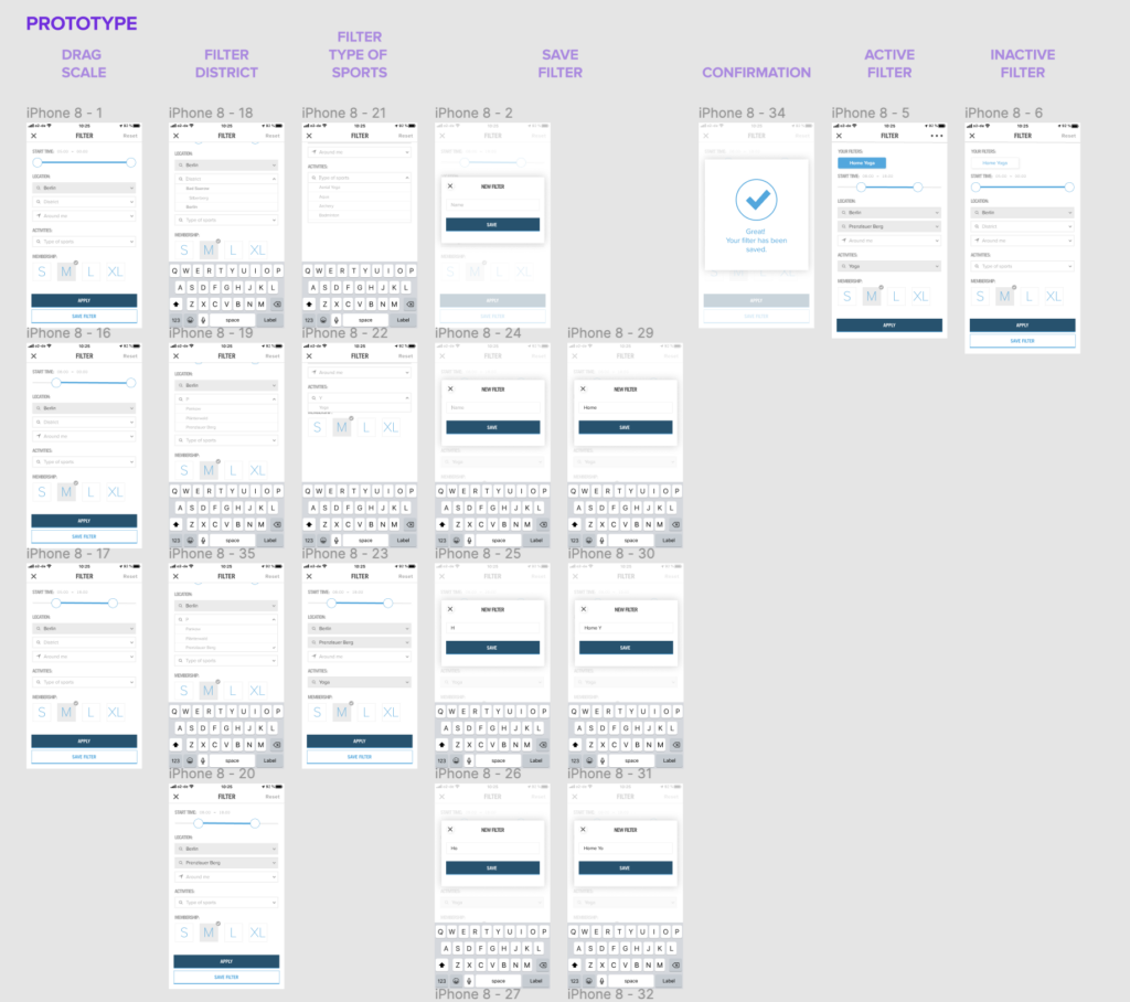
With all the high-fidelity screens ready, I moved on to linking them together for a clickable prototype. Since I had organized my screens and components from the beginning, this part was smooth and straightforward. I used Figma’s Mirror App to test the prototype on my smartphone, allowing me to experience the user flow in a more realistic setting. This step was crucial to ensure that the feature worked well on mobile devices, as most USC users book workouts on their phones.
Outcome and Impact
The result? A filter-saving feature that allows users to customize their preferences, significantly speeding up the booking process and eliminating the need to reset filters every time they open the app. Users can now create and name their own filter sets, access them quickly, and activate them with one click—making the app much more tailored to their needs.
From a business perspective, this new feature increases user engagement by offering a more personalized experience. It also opens up opportunities to gather insights into user behavior and preferences, allowing USC to make better data-driven decisions for future updates.
Conclusion
This project was a fantastic learning experience—not only in terms of UX design but also in mastering a new tool like Figma. The process of integrating a feature into an existing app while maintaining design consistency was challenging yet rewarding. Figma proved to be a powerful tool for prototyping and testing, and its collaborative capabilities make it ideal for future team projects.
Overall, adding this filter-saving feature to the USC app made a noticeable difference in usability, enhancing the user experience and increasing engagement. It’s a great example of how small design tweaks can have a big impact, both for users and businesses alike. And now, having Figma in my design toolkit is like having a secret weapon for creating fast, effective prototypes and collaborating with teams seamlessly.
So, as my yoga teacher says, “hop into something comfy”—and for me, that’s Figma.


