Project Spotlight: "Get Inspired by the Streets" — Editorial Design for Fashion Enthusiasts
This week’s UX/UI design challenge centered around Editorial Design, where the objective was to create a responsive online platform for a magazine, blog, or newspaper. The project had to cater to the needs and goals of a specific user persona—a trend-seeker in the fashion world who craves inspiration but has limited time to consume content. The result? A stylish, user-friendly, and engaging digital experience.

Challenge Overview
The brief asked us to design a responsive editorial platform that would serve as an inspiration hub for someone like Candice, a professional in the fashion industry. The key challenge was to keep the design aligned with her habits—quick, visual content consumption on the go, especially through apps like Instagram and Pinterest. The constraints were clear: we had six days to create a concept, design the platform, and present our final work.
Persona-Centric Approach
Our user persona, Candice, is a busy, trend-seeking fashion enthusiast who uses online platforms to stay ahead of fashion trends. Her preferences revolve around visual content—high-quality photos with minimal text, which she consumes during brief windows of free time. To meet her needs, we aimed to create a visually appealing, mobile-first design that offered a consistent, snackable content experience.
Research & Analysis
We began by diving into Editorial Design and researching the habits of our persona. Through research, we explored three main areas:
- Editorial Design: The shift from print to digital requires more than just translating paper content into a digital format. Readers expect easy accessibility, strong visuals, simple navigation, and consistent design.
- Competitor Analysis: We looked at fashion magazines like Vogue, Cosmopolitan, and Elle, blogs, and social media apps such as Instagram and Pinterest. The common thread was the prominence of visuals and influencer-driven content.
- What is Fashion?: Fashion, by definition, is constantly evolving and shaped by cultural movements. We wanted our platform to reflect this, showcasing street style and the stories behind the trends.
Survey Insights:
To further understand user behavior, we conducted a survey, which revealed:
- 66.7% of respondents read about fashion on social media.
- 56.5% drew inspiration from Instagram.
- 79.2% did not follow traditional fashion week trends.
These insights reaffirmed the need for a digital magazine that deviated from traditional editorial formats, focusing instead on visual storytelling and street style.
Ideation: From Concept to Strategy
Inspired by the persona and research, we brainstormed a concept that centered around the visual power of street fashion. We wanted to capture authentic fashion inspiration straight from the streets, with a focus on:
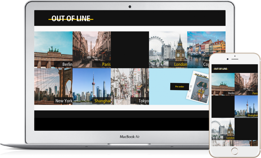
- Outfits worn by real people in major fashion cities like Tokyo, Paris, London, and New York.
- Interviews that highlight the story behind each individual’s style, keeping text minimal
- Responsive Web & App: A seamless experience across mobile, tablet, and desktop.
- Printed Magazine: A twice-yearly curated collection showcasing the best street style.
- No Ads, No Commercial Collaborations: Pure, authentic content with no distractions.
- Focus on Fashion Cities: Major fashion hubs plus a featured city each issue.
Branding & Design Inspiration
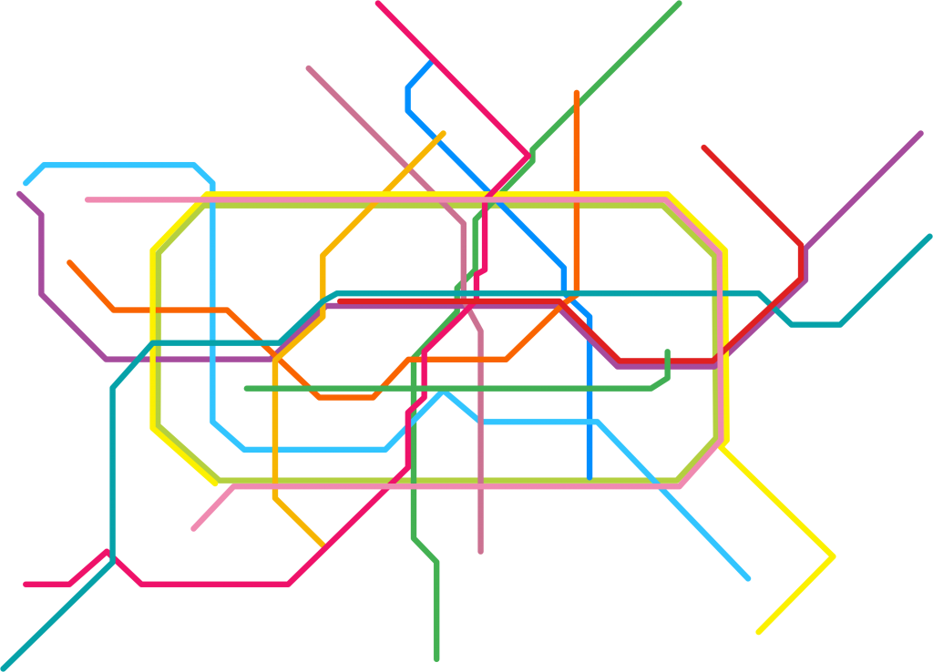
Our brand attributes emerged as URBAN & REAL, steering clear of anything MAINSTREAM or PREDICTABLE. The inspiration for our design came from something as simple as the metro system. Each city we featured had a metro, a common thread that brought together people from all walks of life—just like fashion.
Key Design Elements:
- Yellow Line: The subway’s signature yellow safety line became our magazine’s visual identity, symbolizing the bold, edgy nature of fashion.
- Logo: Our magazine was named “Out of Line,” emphasizing that fashion often needs to break the norm.
- Color Scheme: A strong palette of black and yellow, reflecting urban, underground, and bold style statements.
- Metro-Inspired Icons: Clean, easy-to-read icons inspired by metro signage.


Building the Prototype
For efficiency and scalability, we built all our design elements as symbols and text styles in Sketch, a skill I honed with Alexandre’s guidance. This allowed for rapid iteration and easy updates. We split the work: Alexandre focused on App Design, while I handled the desktop version, ensuring consistency across devices.
User Testing & Feedback
To refine the navigation, we conducted a card-sorting exercise with users to determine how they would filter content by season. This helped clarify the site map and align our content categories with user expectations.
After building a low-fidelity prototype, we tested it with users. Their feedback was overwhelmingly positive, particularly about how easy it was to navigate and the overall clean design.
Presentation & Final Thoughts
After six intense days of research, design, and testing, we presented our final product—a responsive fashion platform that broke away from traditional magazine formats. The street-inspired editorial design received excellent feedback from our colleagues, both for its bold visual identity and its user-centered approach.
Key Takeaways:
- The project emphasized the importance of designing with the user in mind, particularly for a niche audience like fashion enthusiasts.
- I gained valuable experience in design systems, particularly in creating and managing symbols in Sketch.
- Working with Alexandre was a highlight, as I learned new techniques and approaches to rapid prototyping.
This project pushed me to explore new design concepts and collaborate effectively under tight deadlines. It was an inspiring and rewarding experience that resulted in a product I am proud of.
Check out the video of our final product and see how we brought “Out of Line” to life!
